DESIGNER: Marija Knezevic
CLIENT: Hammond Museum and Japanese Stroll Garden
PROJECT: New website
FORUM: SUNY Westchester Community College
DATE: Spring 2014 semester
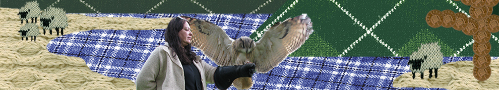
The design and creation of a website requires a number of steps in order to construct a working model which can be brought to life on the internet. My case study selection was the Hammond Museum and Japanese Stroll Garden in North Salem, New York, who provided me with inspiration to create an inviting and colorful website to visitors. As website designer, I took the following steps:
1) Create site map of existing original site
2) Create a graphic site map in color as applied to website redesign
3) Create wireframes as blue prints of new website
4) Color selection
5) Design elements including logos, graphics, and photographs
6) Navigation menu(s)
7) Website page renderings
8) Conversion of renderings to images for web use
9) Website creation with HTML and CSS
10) Testing
The first step (1) was to create a site map. Using the museum’s existing site, I laid out the pages and their branches in a simple text format. Step two (2) was to create a graphic site map in color with modifications as would be applied to a website redesign and to be used as a guide for the building process. Step three (3) required creating wireframes; blueprints of the website’s home page. This is a necessary process to provide visual choices for how a website will look prior to the construction. True to the design process, ideas are worked and reworked. Using my wireframe samples as resource, I began to develop my vision of a new website for the Hammond Museum.

[The museum’s original website]

[Eight wireframes created for website redesign project]
During creation of the wireframes, I explored several color combinations for the website (4). As my case study is a museum, I was inspired by the artists’ palate and their greatest resource — the color wheel. R-O-Y-G-B-I-V represents the primary colors and was a perfect choice to enhance the visual aspect of the website.
Next were to create design elements (5) and most important was the logo. I updated the Hammond Museum logo while keeping true to its original form. Inspired by the flag of Japan, the logo is now in color — a scarlet red — and now honors Japan as the source of inspiration of the Museum’s stroll garden by mimicking the Japanese flag. Also, to help define the details, I have added an outside ring to create a defined border.
Design elements needed for navigation were enhanced by the creation of a graphic. A silhouette of a lotus flower was created and served as the backdrop to a menu bar. The selection of a lotus flower was determined after research on Japanese gardens and the variety of elements used. The lotus formed the building block to the navigational menu (6) and utilized my color selection. The newly created logo depicted in red and represent “Home” was followed by lotus blossoms depicted in orange, yellow, green, blue, indigo, and violet. Also created was a rollover image graphic for each such as the logo turning a white-on-red from the original red-on-white.

[Navigational bar]
Additional design elements were also utilized, including a uniform sub-menu to each page depicted in the mid-left region of each subsequent page, allowing the user to select from a second navigational bar to gain more information on each category subject. Also, the bottom-left of each page depicts a “you are here” marker for users to easily recognize the current viewing page among the many alternate pages. Finally, photographs and social media icons were also used as design elements. The majority of the pages contain a photograph of the Museum depicted in a semi-sphere to recall the circular design of the logo and to further break up the monotony of 90 degree angles along with the lotuses. To keep current with social media, icons were prepared for placement on each web page as a link to social media outlets for easy access.
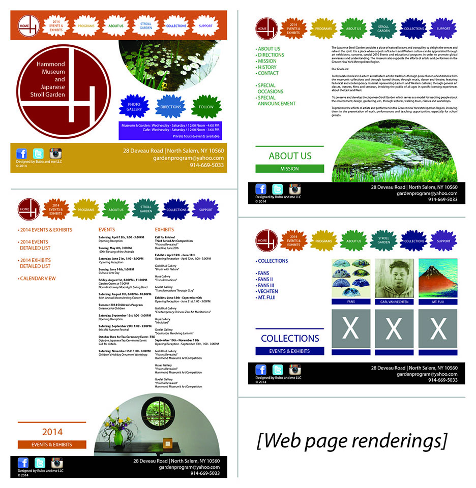
Once all design elements were selected, the simple wireframe came to life through renderings (7) in both Adobe Illustrator and Adobe Photoshop. The various items were placed on each page to depict a final picture of what the website would look like upon completion. Once the final layout was created, the building of the website was able to begin. Each page was “sliced” (8) to create individual images specifically converted for web and allowed each to be imported into Adobe Dreamweaver. What were pieces of a puzzle were placed together along with HTML code and CSS (9) to create a live document that could be supported by web browsers. Although code is universal, the website required testing in various browsers to allow for modifications to create a consistent user experience across platforms (10).
 marija knezevic